Symbol
Use the symbol when space is tight, for avatars, favicons, and compact partner grids.
This page reflects more of the visual and verbal system already visible across the website: the primary lockup, reverse lockup, signature lime accent, dark editorial surfaces, and the core language around decision-ready intelligence.
Use these source files rather than screenshots. The lockup assets below cover the most common web, presentation, and social use cases already represented on the site.
Use the symbol when space is tight, for avatars, favicons, and compact partner grids.
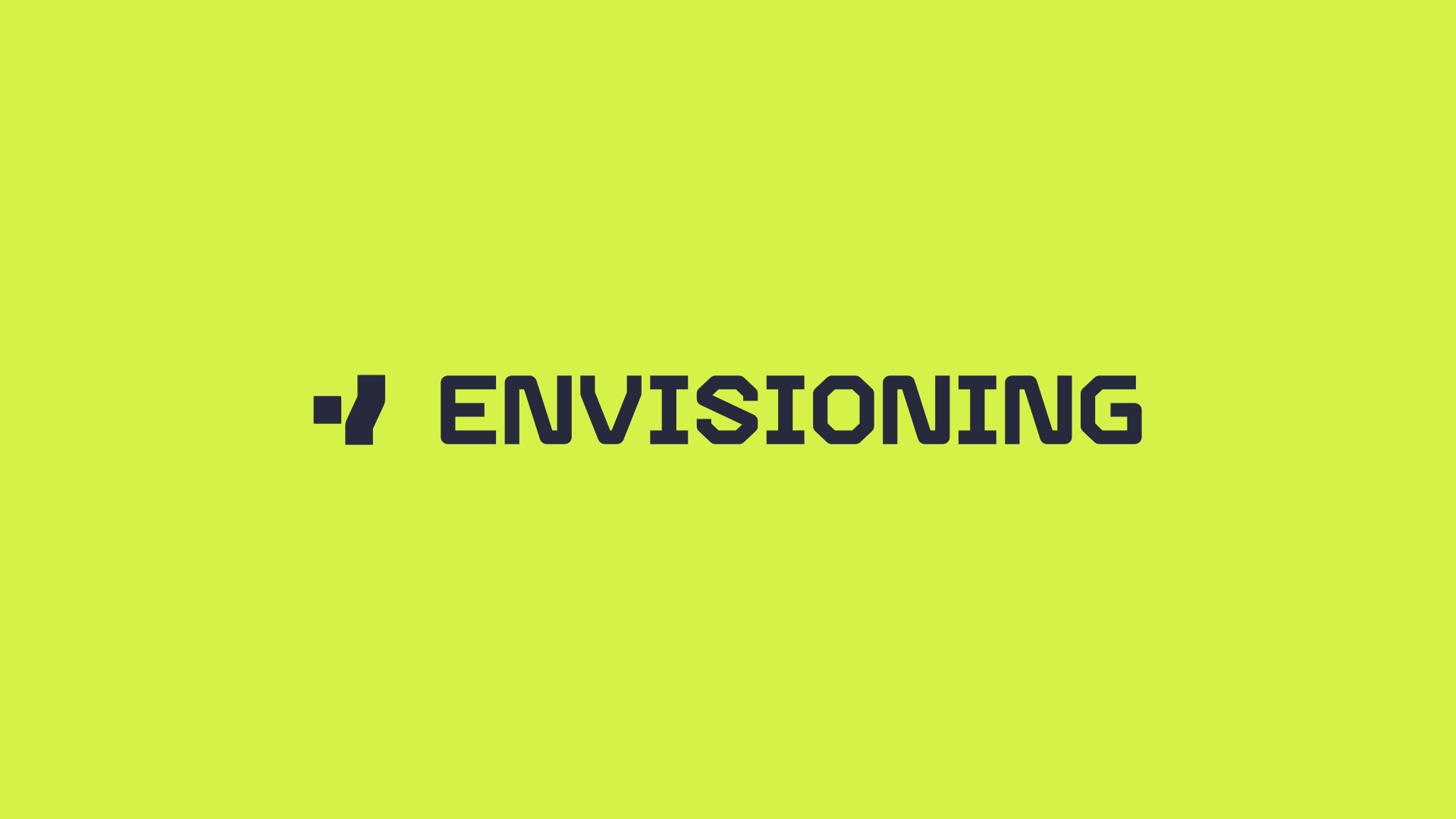
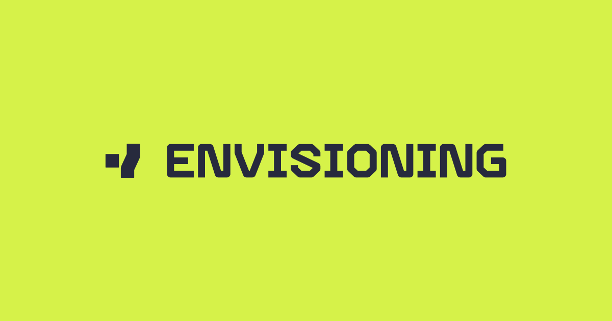
The default horizontal lockup for light backgrounds. Prefer this for webpages, decks, and documents.
Use the reverse lockup on black, deep navy, photography, or other dark surfaces.
The site already signals a distinct palette: lime for emphasis, deep navy for authority, and soft gray-white for breathing room. Treat these as a disciplined system rather than a broad gradient playground.
Primary highlights, active emphasis, and key callouts.
Darker accent for overlays, hover states, and contrast support.
Primary wordmark stroke, body text, and brand anchoring tone.
Dark backgrounds, footer surfaces, and reverse lockup contexts.
Soft section background for calm contrast behind content.
These lines are distilled from the existing About, metadata, and service pages. They are the most consistent verbal signals already present across the website.
Use the symbol-plus-wordmark lockup whenever there is enough horizontal space. Reserve the symbol alone for compact placements.
Use the light lockup on white or pale gray surfaces, and the reverse lockup on black, deep navy, or busy backgrounds.
The lime accent works best as a sharp highlight, not a full-page fill. Keep most surfaces calm and let the accent direct attention.
The site language is spacious, light-weight, and editorial. Avoid crowded compositions or decorative effects that compete with the mark.
Partner materials should feel aligned without flattening either identity. The safest pattern is a calm layout, clear separation, and copy that makes the shared outcome explicit.
When Envisioning appears with a partner, keep both marks visually balanced. Do not overpower the partner with accent-heavy treatment or oversized placement.
Separate lockups with a thin vertical rule or generous whitespace. Avoid decorative connectors, gradients, or overlapping marks.
Do not redraw, recolor, compress, or outline partner logos to match Envisioning. Alignment should create cohesion, not forced uniformity.
In co-branded materials, Envisioning should be framed around the capability delivered: research systems, foresight infrastructure, and decision-ready intelligence.
Use a neutral separator, equal visual weight, and a shared headline focused on the delivered research capability.
Keep the mark, palette, and language disciplined. The brand gets stronger when each use feels intentional rather than expressive by default.
Let the mark sit on white, soft gray, black, or deep navy backgrounds with enough contrast and whitespace.
Avoid placing the lockup over large lime fields or noisy backgrounds where the brand loses its editorial precision.
Use language that names the strategic problem, the research system, or the operational outcome.
Avoid vague innovation language, inflated futurism, or empty claims about transformation without a concrete mechanism.
The verbal identity should sound like the site already looks: clear, light, and structurally rigorous. Keep the emphasis on how Envisioning works, not on inflated claims.
Precise, editorial, systems-oriented, and confident without hype.
Name the intelligence gap, then describe the operating model or strategic outcome.
Close, structure, synthesize, operationalize, refresh, deliver, orchestrate.
Revolutionize, disrupt, unlock the future, game-changing, cutting-edge by default.
Good headlines on this brand should usually connect a strategic problem, a research operating model, and an organizational outcome.
The next useful additions would be a packaged download set, clear co-branding rules, social thumbnail templates, and a tighter voice guide for headlines and partner-facing materials.